
CMYK vs RGB for Book Printing: Key Differences Explained
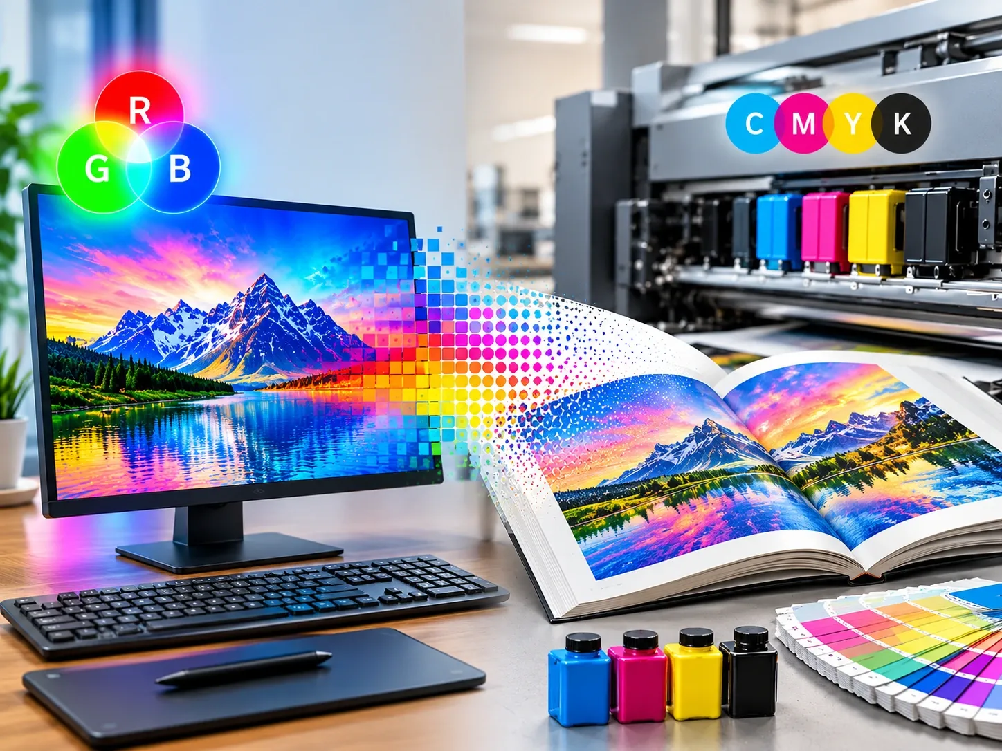
Making a bad choice of colour mode can alter everything about the design you create. Learn more about how RGB and CMYK impact the precision of the colours, the printing process, and even the visual appearance.
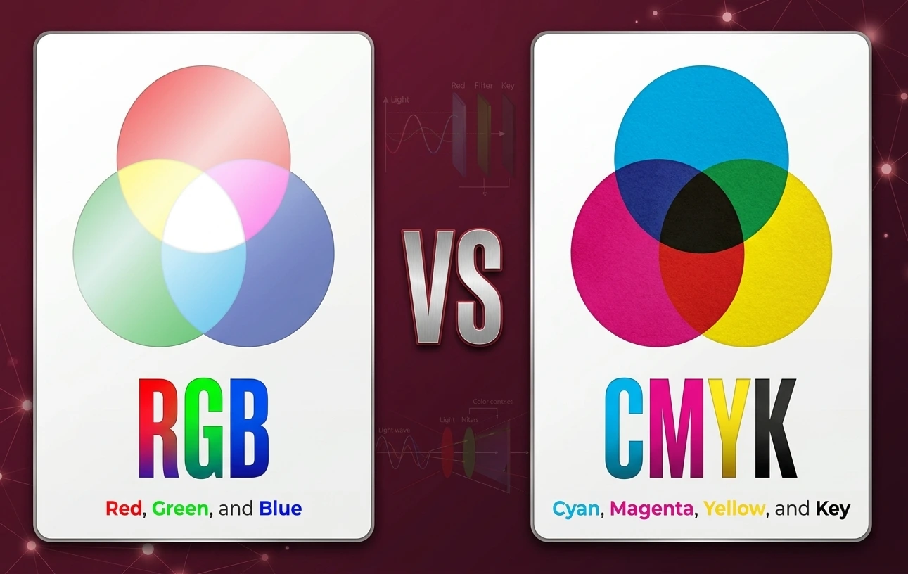
Navigating Digital Light And Physical Ink Modes – CMYK & RGB
Producing bright artwork on a computer monitor is certainly thrilling, but getting the same dull artwork in print form would definitely be very disappointing for the artist.
Computer screens work by using light beams to create bright images, while printing machines work by using ink droplets that absorb light on paper.
Knowledge about the basic technical differences between digital and printing media ensures that the file does not get rejected and avoids colour disappointment in the end.
It is essential for writers, graphic artists, and publishers to understand how light and ink work together for the conversion of artwork from digital screens to paper.
Acquiring good file conversion skills enables artists to keep their artistic vision throughout all their printed works. Knowing how to convert cover art, diagrams, and text layout properly ensures great results every time one prints something.
What Is The CMYK Colour Model?
The CMYK model employs four different physical ink colours: cyan, magenta, yellow, and key (black). This colour model is used for physical printing on paper, packaging, and merchandise. Unlike other colour models, physical inks do not emit light but absorb light to produce colours.
Combining these four colours allows commercial printers to make thousands of colourful designs. The preparation of artwork in CMYK guarantees that the colours will not change on the printed page.
What Is The RGB Colour Model?
The RGB colour scheme uses red, green, and blue light in creating visual displays. This scheme works by mixing the three lights across many tiny pixels found in computer monitors, cell phones, tablets, and TVs.
The combination of all three lights, red, green, and blue, at maximum intensity creates white light. RGB colour scheme suits the digital world perfectly, as it creates neon colours easily displayed by digital devices.
Switch To Four Colour Inks For Precise Physical Printing
Digital files are converted from screen light to four colours of physical inks during the transition process from computer screen to commercial printing presses. Full colour images are created by the mixing of cyan, magenta, yellow, and black inks on paper.
The knowledge of CMYK vs RGB allows the designer to tweak artwork colours before final submission to the production press. Physical paper is a passive object that reflects light rather than emitting it, so physical ink mixtures absorb certain lights when they are used to form colours.
Pre-flighting artwork files in 4-colour ink modes leads to pages that closely resemble ink modes designed on the computer. Early conversion avoids unwanted colour shifts so graphics printed on the press remain rich, clear, and professional in every run.
Optimise Image Files To Ensure Crisp Printed Graphics
The high resolution of graphics poses a challenge in preparing them for the transition from digital to physical paper stock to ensure a clear visual presentation. Low-resolution images that appear good on computer screens may appear blurry or pixelated when printed using physical ink dots.
Creating artwork files using proper colour profiles and image resolutions ensures that colour transitions and design details are smooth and crisp. High-quality colour printing methods guarantee that all text and graphic details, including photos, come out incredibly clear and vivid.
A correct file format protects your design investment from the common errors in the pressroom. Properly prepared files will guarantee the printing of books, marketing brochures, and posters that instantly catch the eye of the reader.
Adjust Dark Shadows To Prevent Oversaturated Page Inks
When all inks are used at their highest percentages, they produce high physical ink coverage which may penetrate paper sheets. Thick layers of wet ink result in long drying time, buckled paper, and unwanted ink smears on physical pages.
Controlled total ink limits maintain a sharpness of detail on the dark areas without creating ink load issues on the paper. Understanding the difference between CMYK vs RGB for book printing ensures that authors can balance rich shadow colours without causing ink bleed into neighbouring pages.
Correct shadow density values ensure clean separation of the pages during fast commercial printing. Proper ink usage ensures sharp text contrast and makes it easy to read your manuscript word-by-word through each chapter.
Partner With Regional Printers For Exceptional Book Quality
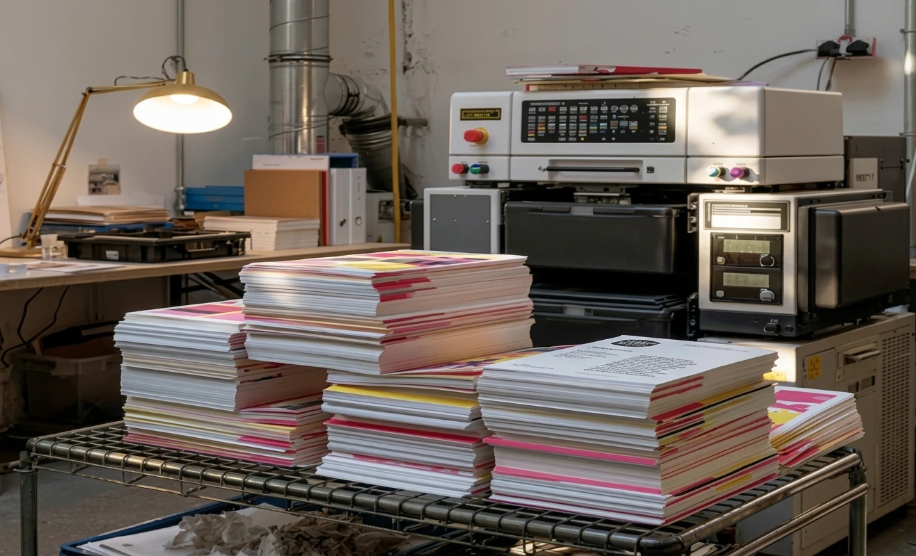
Partnering with a professional commercial printing service will ensure your manuscript is professionally checked, proofread, and prepared for the press. Artwork files are checked for colour discrepancies by the skilled print technicians before running large print production runs.
Professional book printing services offer guidance to authors on choosing the best paper weight, surface, and binding options. During live runs, professional press operators will optimise ink levels to ensure that all copies match a specific colour.
Cooperation with the knowledgeable printing specialists saves precious production time and reduces the expenses of reprinting files. Collaborating with industry professionals ensures that your printed book will look great and conform to international standards for book printing.
Select Premium Paper Stocks To Maximise Visual Impact
Printed ink colours are significantly affected by the physical texture, brightness, and coating of a paper stock. Glossy paper coatings ensure that ink stays on the surface and provide vibrant colour, while uncoated paper absorbs ink for a matte feel.
Leading book printing Abu Dhabi companies provide authors with the opportunity to experiment with different paper textures and coatings for the printing of their publication. Printed proofs on actual stock allow writers to be sure that colours, contrast, and visual elements will look great on all completed pages.
Choosing the right paper style will enhance the tactile experience and aesthetic of your printed book. Using the best paper stocks to produce your artwork design gives the reader a professional, upscale reading experience.
Maintain Proper Colour Standards Across Multi-Copy Runs
Achieving uniformity of colour across thousands of pages printed from a press demands careful setup of that press and constant quality control by the press operator. During long runs, the colour appearance can be slightly different due to changes in the press temperature, humidity, and ink flow.
Commercial print shops use automated colour management systems to continually monitor the density of the ink during the print process. This regular press check ensures colour accuracy is exactly the same in the first and last copy off the press.
Sticking with the same colour ensures that the brand is safe and gives visual consistency between various volumes of books and marketing materials. The consistent colour management guarantees that your printed product will appear professional, consistent, and eye-catching on every shelf.
Simple Answers Regarding Screen And Paper Colours
Why do colours appear brighter on a screen compared to on paper?
Computer monitors produce bright images due to direct light beams through RGB pixels and thus make colours appear brightly coloured. In contrast, paper cannot emit any light; instead, it reflects surrounding light from CMYK ink drops. The final result is a set of naturally duller colours.
What will happen when I print an RGB file?
The printer’s computer program will automatically convert all colours in an RGB file into CMYK colours. Without calibration, the results usually include dim colours, as blues, greens, and pinks often appear too dim, dark, or even muddy.
Are all RGB colours printable in CMYK format?
No, some digital colours cannot be reproduced due to the narrower colour gamut of CMYK colours. Many bright neons and digital bright colours cannot be replicated via cyan, magenta, yellow, and black inks and need special spot colours.
What is the process of converting the artwork from RGB to CMYK?
Conversion can be done using design applications such as Adobe Photoshop and InDesign by changing the colour mode of the document to CMYK. Pre-flighting the file enables one to adjust the brightness, contrast, and saturation before generating the print-ready PDF file.
Does paper have an effect on CMYK colours on the printed material?
Yes, the choice of paper stock affects the colour appearance greatly. Coated glossy paper keeps the ink on its surface, making the colours bright and vivid, whereas porous uncoated paper absorbs the liquid ink; hence, colours appear soft and dark.
Conclusion
A clear understanding of the technical nuances between screen colours and physical print colours is critical in producing professional publication results. Through the conversion of the file from screen colours to four-colour ink colours, controlling the shadow ink levels, and selecting the right paper stock, authors will be able to produce work that prints effectively. Cooperation with highly skilled partners in commercial printing enables accurate pre-flight, proofreading, and calibration of the press. These measures avoid any surprises concerning changes in colour, ink smudging, and guarantee clear typography in all printouts.